Welcome to my A2 media blog. I'm Angela Chen and my candidate number is 9025. I am working in a group with Thakshana Yogeswaran(9179), Monica Aghadiuno(9365) and Godgift Emesi (9044). We are group 3. To navigate my blog please click on the 3 labels to the right of the page below named A2 Research and Planning, A2 Construction and A2 Evaluation.
Group 3 - Music Video
Group 3 - Digipak
Our Digipack, top left - back, top right - front, bottom left - inside panel, bottom right - inside panel (CD)
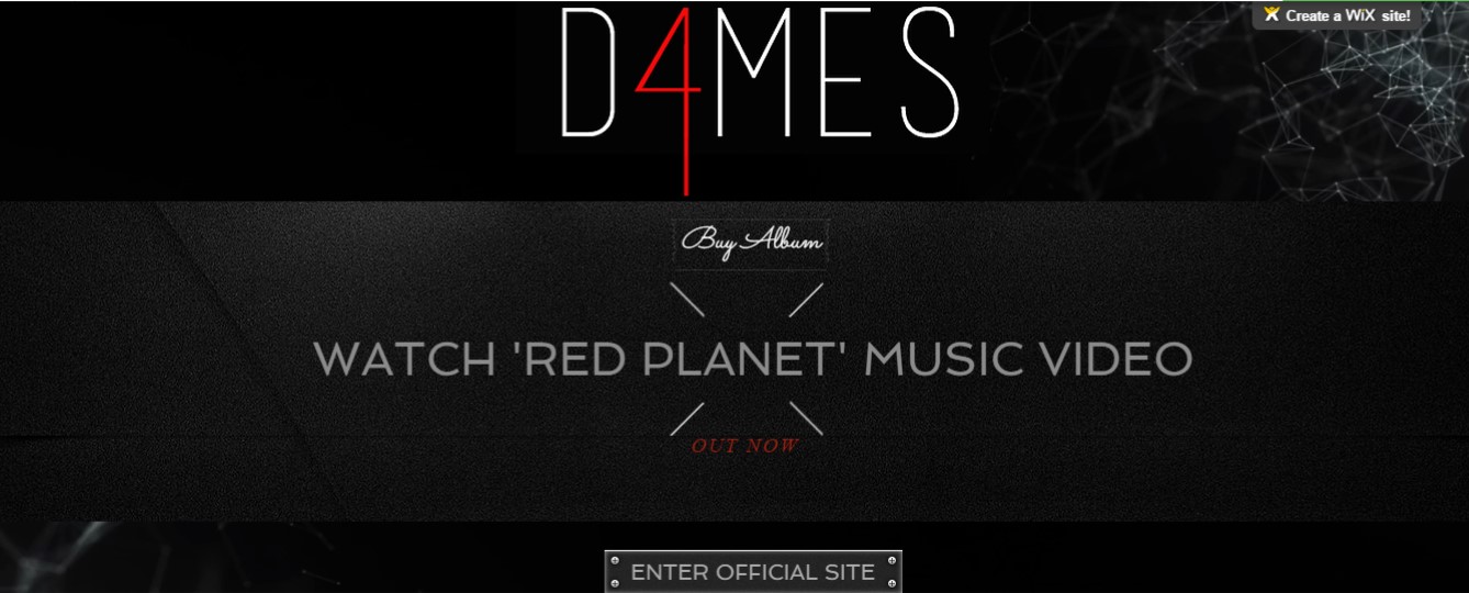
This is a link to our website, click the image above to enter our site
Showing posts with label A2 Construction. Show all posts
Showing posts with label A2 Construction. Show all posts
We used Wix, a free cloud-based web development platform that allows users to create HTML5 websites and mobile sites, to create the D4MES music website. We liked Wix as it is simple to use with their online drag and drop tools but also it has a variety of editing functions and features which allowed flexibilty in how we wanted our website to look.
Here are our original flatplans for the website layout:
Firstly we started with a template from the music section and personalized it using a simple black background. Then we created the header with the D4MES logo on top and navigation options below which we made to show on every page the viewer clicked on. Each button on the header is linked to another page. We decided on a red,black and white colour scheme for brand image and consistency. Athough those colours sound more like the colours you would see on a grunge, punk pop band's website, we made it work as the font on our website was simplistic and giving it a classy, RnB vibe.
At first the logo was centered on the header and even larger in size but after we asked for feedback we decided to change it. Criticisms from teacher feedback: "A centred header is quite general in style,maybe try something more interesting" "There's so much empty space around it that could be used" Crticisms from fellow students and audience members: "The font is a bit too big - it looks slightly awkward and takes attention away from the main statement images"
Although a centred header is not uncommon, it did not add anything to our website so we placed the header to the side which we thought added to our minimalist, classy vibe instead. We also realised that our website was not interactive enough and could use the space to the right of our header better so we put a subscription option on the right of the page allowing fans to be updated. This is a key convention of artists' websites.
After some thought we decided to create an 'enter site' page as it was a common convention and allowed us to make certain features more prominent such as getting the audience to buy our new album and watch our newest music video.
We filled our homepage, meet the girls page and the gallery page with photos of D4MES to add visual richness and show off our 3 dimensional characters. We also included classic features such as a news and store page where fans can be updated by our live twitter feed and buy merchandise. This is to increase their interactivity with us as a girl group and give them a chance to buy into and be part of our brand and identity. Of course we added social media links at the footer of every page.
Overall the website turned out nicely and we all did our share of the work on it. The only thing that annoyed me was the fact that we had to manually crop pictures to fit either our heads or our legs in as we could not do it on Wix. Everytime we inserted an image it would not be to size. Other than that Wix was generally easy and convenient to use.
Although we had a flat plan for our album cover and back, the end product differed greatly to what we'd first imagined it to look like. Nevertheless we're happy with how it turned out. The process was very experimental as weren't so sure on how we actually wanted it to look.
For our digipak we decided to use Adobe Phototshop CS5.5 to edit our images and put them together. This worked out really well as most of us already had a lot of experience working with photoshop.
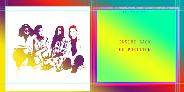
We worked with a digipak template shown below.
The green area was allocated to the photo
The blue area was allocated for any text spillovers
The red line was the 'bleed line' - anything in that area would get cut off during printing
This is a picture of our original flatplan which consisted of us standing against a brick wall and one of the inside covers being an arty geometric design.
Me and Thakshana editing
The hard part was choosing which photos we wanted to use which resulted in our digipak process being very long due to much experimentation.
We wanted to used the photo below at first as we really liked our outfits however the pose did not seem quite right or bold enough for the front cover. We wanted something that made more of a statement.
Thus we changed it to the photo below as it has the professional, classy girl group image that we wanted to portray.
The process of editing our digipak:
1. Using the selection tool and the magic wand we removed any backgrounds.
2. We used the define edge tool to remove any white edged and rough edges around us for example around our hair.
3. We increased or decreased the size of our image using 'show transform' option and placed the image where we wanted it.
4. We would crop anything we didn't want out.
This is the first final draft of our album front cover (above) and inside cover (below). The back cover of our album (top left) surprisingly turned out very similar to our initial plan so we were very happy with it as it worked out to how we first visualised it. However after asking for feedback on our digipak from our target audience group and teachers we realised we needed to make changes to the front and inside. Positive Feedback: "I like the consistent colour scheme it's classic but the red keeps it interesting" "I like what you've done with making some letters red" Criticisms: "The background of your inside cover is not nice, it looks very grunge and moody, I don't feel the rnb or pop vibe" "The inside image of you all looks very washed out so you kind of blend in with the background" "There's quite a lot of space around you on the front cover, you girls need to fill up more of the frame"
We agreed with the criticisms so decided to improvise and make some changes. Below is me and Thakshana's drafted result of our research on cool Photoshop effects. We wanted to create an inside cover that contrasted the front and made a statement.
However this was not working out well as it did not suit our band image. In the end we decided to use the background of our front cover in order to keep the consistent white and grey theme. We also made the image above black and white as that looked lot cooler and fit in with the monochrome look. Just as we added red letters to the back of our album, we put our star names up with a red letter each. This used the empty space around us effectively. Below is the end result.
Having previously used and enjoyed Adobe Premiere Pro CS5.5, we decided again to edit our video using the program.
Above is our edit suite.
PROCESS
1. After importing the clips we wanted to use onto Premiere, we created tracks and copy and pasted over the edited Red Planet song from our test edit and dragged it onto the audio track.
2. Then we started cutting clips and dragging them onto the video tracks. We had to make sure they were synced so that our lips were singing the song perfectly in time to the audio.
3. Then we each put in and edited our own individual shots according to the visual image of what we wanted our own sections to look like in mind
4. We collectively edited the sections of the video featuring scenes of the whole group.
SPECIAL EFFECTS
We proceeded to use special effects such as slow motion, reverse speed, wave warp, fade to blacks, cross section fades, lens flare effect and ProcAmp.
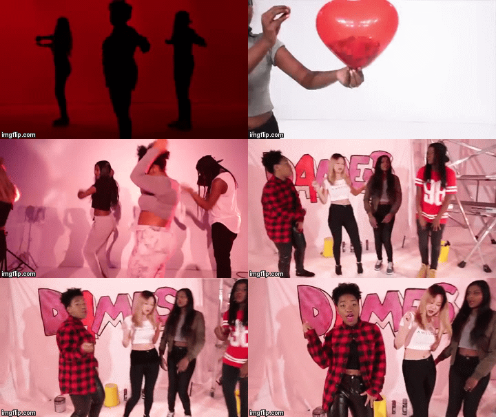
We used the slow motion and reverse speed often in conjunction to create arty scenes such as the balloon and confetti scene below. The balloon popping and confetti falling was originally very fast but we slowed it down by changing the duration of the clip to 200% and then used the same clip again but ticking the reverse option so that it would play backwards giving the illusion of time rewinding.
Feedback from our target audience (a group of young girls) included really liking the flashes in and fast cut aways we currently had so we put more in to make the scenes more dynamic and visually engaging as they were impressed by them. An example of that is also in the clip to the right
We often placed cross section dissolves onto the end of one clip and the start of the next so that the shots transitioned nicely into the next for example in the clip to the right.
This clip also shows the very beginning of our music video which previously started with Thakshana's spotlight shot. However one of our teachers said that it would be more suitable to introduce us as a group and then come in with the individual shots which was a key convention of band music videos. Thus we made our changes accordingly. Wave warp was an effect I found as an alternative to the old, static TV effect we originally had in mind. It worked well when we introduced a small wave and then a larger one shortly after to build up the dramatic effect. A great example of this is during my verse.
ProcAmp was very useful for grading which was the final step of editing the music video. This meant adjusting the brightness, contrast, hue and saturation of our all our clips.
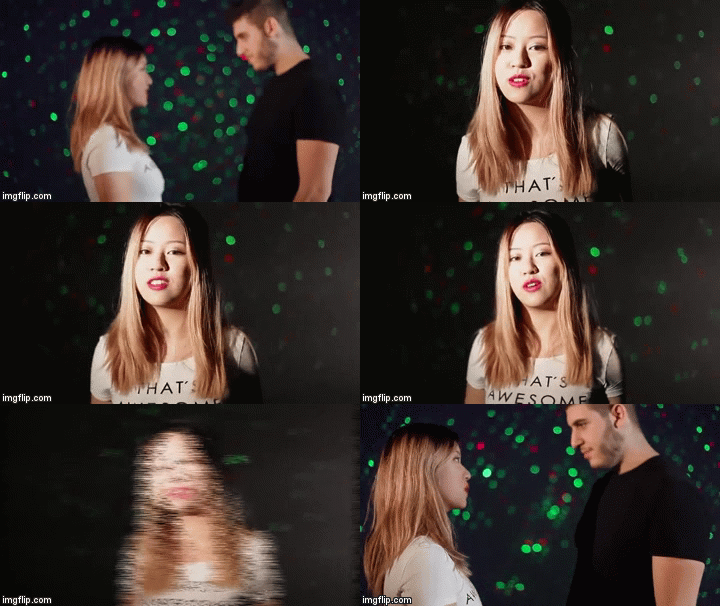
Another interesting effect we found was the lens flare effect. This added more impact to the laser set up of my scene as it helped to intensify the galaxy/space vibe of my verse. At first this lens flare was static but after watching a tutorial in YouTube I learned how to move the flare in order for it to look more natural as there is camera movement which moves me around in the frame.
Overall I'm very happy with how we edited our music video, we put in so much time and effort which paid off.
Our set is to the right. We had extra lighting and the flash feature in order to take the best photos possible.
I think the first promo shoot session went really badly as we had technical difficulties such as the flash on the lights not working which meant most of our pictures turned out really dark. Also the camera was not in focus for a lot of the shots. We didn't check up on our pictures as we were taking them so we didn't realise that at least one of us were unprepared in each picture - we never got ready at the same time to have our picture taken.
Gift doing Monica's hair below.
Me doing my hair at the vanity table.
Example of one of our bad pictures from the first shoot
The next promo shoot went a lot better. The flash was working and we made sure the camera was in focus. This time we checked our pictures every few shots and also counted down subtly to get ready together, in sync for the pictures. Since me and Monica had the same frees we took each other's individual shots which turned out really nice. We played with props such as a chair which I thought Monica looked quite cool sitting backwards on. However her legs looked slightly awkward in the pictures being spread out so much so we didn't use those but kept them if we wanted to zoom in and tighten the frame as her facial expressions were on point. Monica also shot my picture from low angles to give a more dominant vibe and directed me well telling me which facial expressions looked best.
The classy promo shoot was quite difficult as the poses we tried looked very awkward a lot of the time. We wanted to give off a classy prestige vibe but ended up taking pictures which looked like prom photos or family photos. In the end we went with a simple concept and stood side by side as most girl band album covers feature the same poses. Below are some of the nicer selection of photos from our shoots.
Graffiti backdrop - industrial like set up with spray paint cans and buckets
Red lighting - group shots with boys (posing)
Classy scene - involving a long table red cloth, wine glasses
Laser setup - mine and Marios' scene
Scaffolding - Thakshana's and Monica's scenes with their partners
Monica - re-shoot of her individual shots
Day 4 - Thursday 26th Nov
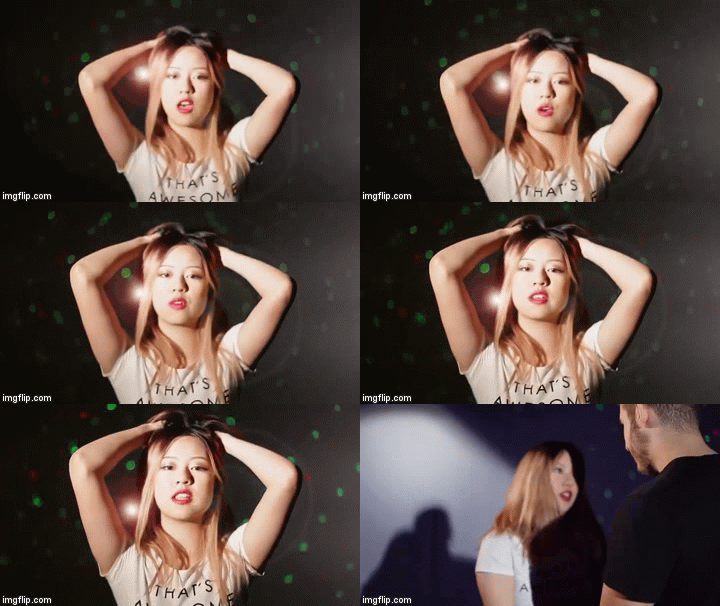
This day was dedicated to shooting mine and and Mario's scene with lasers. Despite the challenges we faced when shooting my own scene with this setup, we improvised successfully with the help of Emma, our technician. We set up two lamps at separate ends of the stage facing towards mine and Mario's bodies. This allowed both our faces to be lit. However Mario is a lot taller than me so my face became shadowed when I moved backwards. This meant we had to work out an area that I could move in while staying lit.
When I push Mario away I could not move back much as I also had to stay in frame. The end result was very successful.
We had feedback from quite a few people who visited us during our shoot. These were their opinions: "It looks much better this time, the lasers stand out a lot more" - this was also due to us blurring out the background to largen the size of the laser lights on screen. "Your acting with Mario doesn't look awkward despite the lack of space you can move around in" - this was due to the narrow areas of white light
"You got rid of the shadows!" - this was due to successful positioning of the floor lamps Day 5 - Friday 27th Nov
We shot our group shots in front of the scaffolding on day 5. This involved shots of us just posing quite still trying to look cool. We also shot us pretending to spray paint D4MES onto the backdrop to add to the street vibe.
We also shot all of Thakshana's individual shots in front of the same backdrop.
We also shot Monica and Will's scene as he was available to kindly come after school. This allowed us to free up our Saturday schedule as it was already quite packed due to all the boys only being collectively free on Saturday to film the mass group shots. Day 6 - Saturday 28th Nov
Saturday involved shooting the dinner table scene and mass group shots with the boys.
Initially for the dinner table scene, all four guys were serving and waiting on us girls sat at the table but we decided that there was too much going on and four waiters were unnecessary. In the end we decided to coast two waiters. We managed to get varied shots of this scene, one being a close-up of champagne being poured into a glass with me in the background which I thought was quite cool as we planned to slow mo some of these shots for effect.
For our mass group shots we posed with each of our partners. This included cute poses, confident cool poses and loving poses to create that 'SQUAADD' image.
We also shot Thakshana and Aaron's scene which was quite long as her verse was long. They had a lot of screen time so we needed to fill that screen time up making sure it wasn't boring or dragging on for too long. Thus we decided that they could use the large space available and Aaron could walk towards Thakshana backing her up against the scaffolding.
Beauty shots with full white lighting and a white backdrop
Chorus dance shots in most backdrops
Film our filler shots such as the balloon and confetti shots
Film me, Gift and Monica doing our individual verses in our personal backdrops (strobes etc.) and spotlight setup
Review footage to identify anything that needs to be re-filmed and alter our schedule accordingly if needed.
Monday
Day 1 of shooting went really well. We were very excited and headed straight into lighting, makeup then shooting. Despite coming into the studio on time, we still got slightly behind schedule as we did not realise how long it took to do our makeup and set-up. For example for the lighting we had to manual maneuver the lights in order to have them in the right angle and with the right flood level.
What we finished filming that day:
Silhouette shots against red background
Individual shots white background XCU
Spotlight shots of me and monica
group dance white background
I think our spotlight shots turned out well as it looked like neon jungle's but we made it our own by covering half the lamp with a red filter in order to create a cool gradient. The lamp was quite heavy to use so I had to move it really slowly to achieve a smooth pan for Monica's shots. Me and her had a lot of frees together so we filmed each other's shots a lot of the time.
The video below includes my thoughts on how the first day of shooting went.
Tuesday
What we got done that day:
Monica's individual verse pink lighting
Panel background set-up - dancing in pairs
Floor lamps pink lights set-up - group dance
Monica's black background + strobe lighting effect
I loved how Monica's individual scene turned out. We kind of free styled this shot as the blackout and dimmed white light we planned to use just created a very old-fashioned vibe we didn't like. In the end we used a blackout setting and white strobes which lit in rhythm to the beat of the music we put on through speakers. This achieved a very jumpy, club-like atmosphere which worked very well with her rap verse. This combined with her pink backdrop shots contrasted nicely.
We also shot our panel background setup which looked really good with pink and orange lights lighting it up from behind. Our only issue was that the size of that backdrop was too small to fit all four of us dancing at the same time. We improvised and danced in pairs, planning to edit it together which worked out much better in the end.
Wednesday
We ended up not having much to shoot on Wednesday as we had to reschedule some scenes as shown below on the original version of our shootboard and then the edited version. However we started shooting I'd say what was our most difficult scene that day which was my scene with Mario. However the boys weren't scheduled for shooting that day but we felt to try this setup out as we knew it would be complicated. It required setting up laser lights and dimmed floor lamps. This scene took a while to master. The white lights had to be bright enough for my face to be lit but not too bright that it drowned out the colours of the lasers. First we tried one lamp then we set up a second lamp which shone a narrow beam of light onto my face. This worked out better.










 However we started shooting I'd say what was our most difficult scene that day which was my scene with Mario. However the boys weren't scheduled for shooting that day but we felt to try this setup out as we knew it would be complicated. It required setting up laser lights and dimmed floor lamps. This scene took a while to master. The white lights had to be bright enough for my face to be lit but not too bright that it drowned out the colours of the lasers. First we tried one lamp then we set up a second lamp which shone a narrow beam of light onto my face. This worked out better.